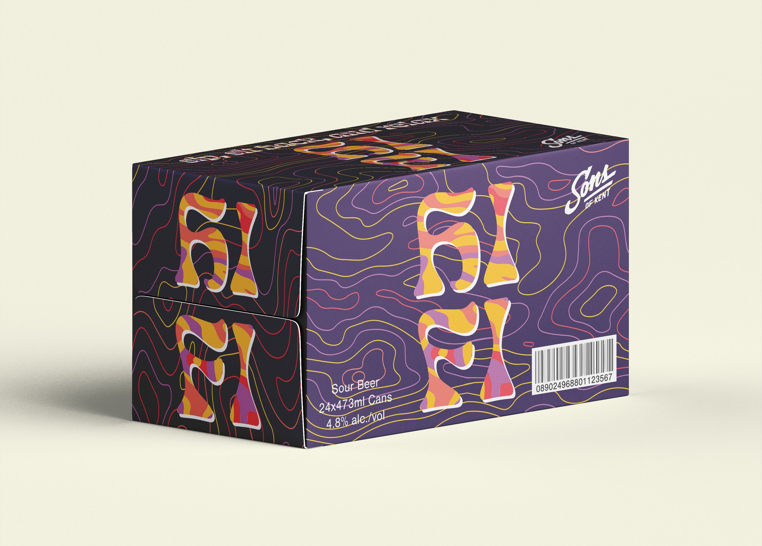
Sons of Kent Hi Fi Sour Beer Redesign
For this project, I took one of my favourite craft breweries
and redesigned its packaging in both the 2D and 3D space. The design for this project was inspired by the ingredients of the product, a sour beer with various fruit flavourings. The original packaging design for Hi Fi is updated here with a psychedlic inspiration. The beer label uses colours that represent the flavours of the beer while the box provides a strong contrast that still unifies design.


